Google Is Testing a New Format for Ad Labels Within Search Results
By: Rank Media

Another day, another user experience test launched by Google.
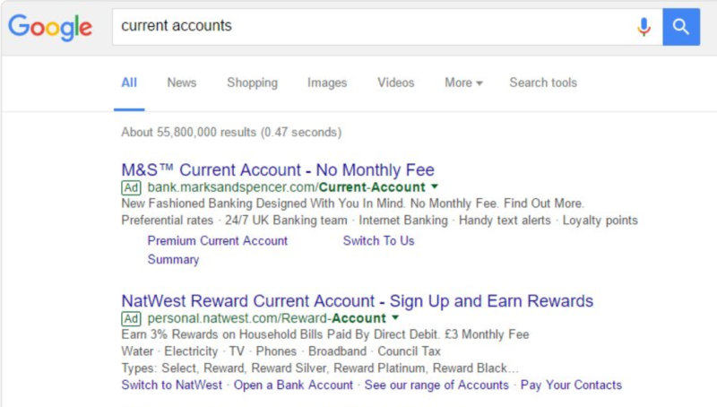
Shortly after shocking the world (well, maybe not the whole world, but rather the search community) by changing the traditional yellow ad label to green, it seems like Google is experimenting with a new design according to screenshots from Twitter user @matibarnes. As exhibited by the screenshot below, the new green ad label has been inverted, with the colour green being used as the outline on top of a white background:
Google is known to experiment with the core design and test new features within search engine results, so this should come as no surprise. The interesting aspect of this test is that the new format seems to blend in more with the the display URLs of search results than the green ad label, which could potentially lead to a higher click-through rate for ads vs. organic listings. As you can see from the screenshot below, the current ad labels on a green background stand out more than the test ad labels, even though the differences are rather subtle.
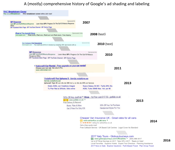
Although many within the search community believe the move from the yellow label to green was implemented to make it more difficult for users to distinguish ads from organic results, the search engine giant has stated otherwise. Sundeep Jain, currently the director of product management for search ads, stated that the transition was part of an overall process to streamline the elements on search results pages. Of course, it would not be surprising if Google was disingenuous in this regard, especially when you see the transformation of Google ads from 2007 to today (thanks to Search Engine Land on preparing the graphic below). Google will continue to do its best to ensure that ads are blended in with regular search results in an effort to push more businesses to use the Google AdWords platform.

The day will come where it will become difficult to differentiate an ad from an organic result. It’s only a matter of time…


 (800) 915 7990
